 Wingo AI Analyzer
Performance Overview
The performance overview displays key metrics from your analytical sessions, including total analyses completed and summary statistics. These figures help you understand the scope of your exploration activity within the app.
Deep dive into the analytics features that power your pattern exploration — from performance metrics to neural activity visualizations.
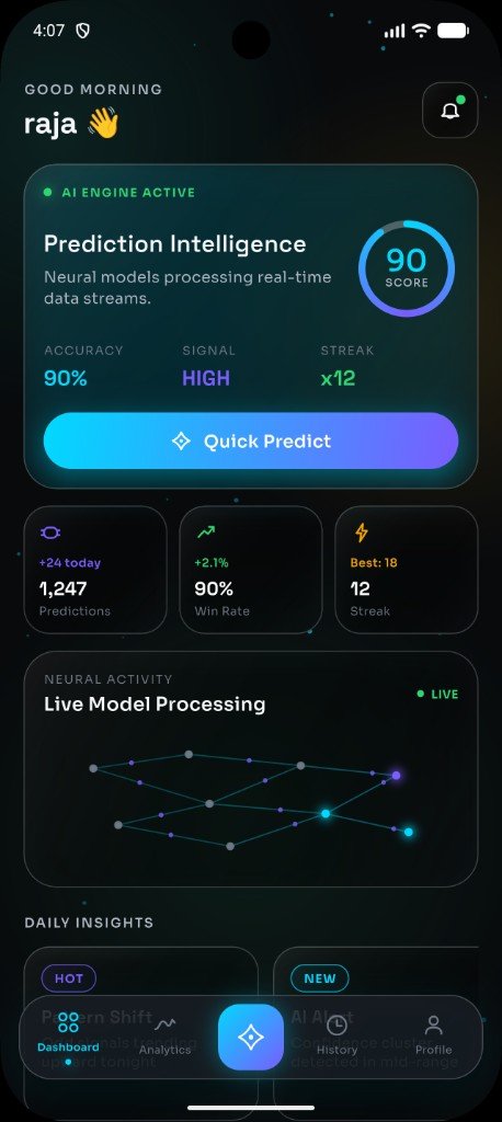
The AI Analytics section of Wingo AI Analyzer provides a centralized view of your analytical activity. It brings together performance data, trend visualizations and pattern distributions into a single, easy-to-navigate dashboard designed for exploration and learning.
The performance overview displays key metrics from your analytical sessions, including total analyses completed and summary statistics. These figures help you understand the scope of your exploration activity within the app.
A line chart tracks how analytical insights have compared to outcomes over time. This trend visualization is an interface example of past session data — it should not be interpreted as a guarantee of future performance.
Bar charts and distribution views show how different patterns appear across your analyzed sequences. This helps identify which digit combinations or trends occur most frequently in your data.
Review historical data across all your sessions. The historical analysis view lets you scroll through past insights, compare time periods and observe how patterns have evolved.
The neural activity display provides a visual representation of the app's analytical processing. Animated nodes and connections create an engaging, AI-inspired experience while analysis is underway.
Detailed metrics including session counts, pattern frequency and confidence-style indicators give you a comprehensive picture of your analytical journey. All metrics are derived from app usage data and presented for informational purposes.